Friday, December 17, 2010
Wednesday, October 6, 2010
Monday, September 13, 2010
HTML5 and Even Fancier Forms
It’s a brand-new world for those of us working in the web industry. Browser vendors are ahead of the game, and are implementing HTML5 support before it becomes a W3C standard. Many web developers are already taking advantage of this by coding websites in HTML5. There’s the much ballyhooed video element, which allows you to serve streaming videos without Flash; there’s semantic document markup with elements like article andsection. But what about HTML5 forms? What’s happening there?
At first glance, you may be disappointed with what HTML5 currently brings to web forms; each browser is implementing the new elements slightly differently, and the most impressive features are yet to be fully ready for prime time. However, if you dig a little deeper, there is untapped potential that you can use right away—and boy, doesn’t the future look bright for forms!
Let’s take a closer look at HTML5 forms, and uncover today’s practical applications while peering into tomorrow’s bounty. There’s something for everybody, with improved usability for mobile browsers, sweet CSS, and easier ways to drive everyday form functionality like placeholder text.
Introducing New Input Types
The current draft of the HTML5 specification brings with it 13 new input field types. Yes, thirteen brand-new, shiny ways of defining the good old input element, so make some room beside text inputs for the following:
emailfor email addresses, perfect to use immediatelytelfor telephone numbers (some browsers may strip whitespace), fine for immediate useurlfor web addresses, good to use nowcolorfor hexadecimal color values; here’s hoping we see OS-native color pickers in the future!numberfor whole numbers; some browsers provide up/down arrows next to the input field. You can also limit the number to a given range with theminandmaxattributes.rangefor a numeric input with a slider widget; like thenumberinput type, you can useminandmaxattributes to define the range. You can also use thestepattribute to control the increments in which the slider moves. This is ready for use, as browsers that don’t support it will simply display a text field—but be careful how you use this one. Regardless of how cool they may look, sliders are only good for certain tasks (such as price ranges); in most cases, a regular number field will be easier for your users.searchfor search keywords, so naturally just the tool for site searches. Be wary of the current Mac OS rendering: it looks just like the built-in Spotlight search, but there’s no overriding the styles if you need to display it differently. Take a look at the Apple website for an example of it in action.date,month,week,time,datetime, anddatetime-localfor date-related inputs. Several exciting new fields—now we just have to wait for all the browsers to implement it.
Saturday, August 28, 2010
Tuesday, August 24, 2010
Building a custom HTML5 video player with CSS3 and jQuery
Introduction
The HTML5The other major barrier to consider is building up a custom HTML5 player — this is where a Flash-only solution currently has an advantage, with the powerful Flash IDE providing an easy interface with which to create a customized video player component. IF we want to write a customised player for the HTML5 element we need to handcode all the HTML5, CSS3, JavaScript, and any other open standards we want to use to build a player!
And this is where this article comes in. This is the first of a series in which we will look at building up an easily customizable HTML5 player, including packaging it as a simple jQuery plugin, choosing control types and outputting custom CSS for your own situation. In this article we will look at:
- Video controls
- Basic markup for controls
- Packaging the player as a jQuery plugin
- Look and Feel
- Themeing the player
Video controls
As professional web designers, we want to create a video player that looks consistent across browsers. Each browser however provides its own different look and feel for the player, from the minimal approach of Firefox and Chrome, to the more shiny controls of Opera and Safari (see Figure 1 for the controls in each browser). If we want our controls to look the same across all browsers, and integrate with our own design, we'll have to create our own controls from scratch. This is not as hard as it seems.
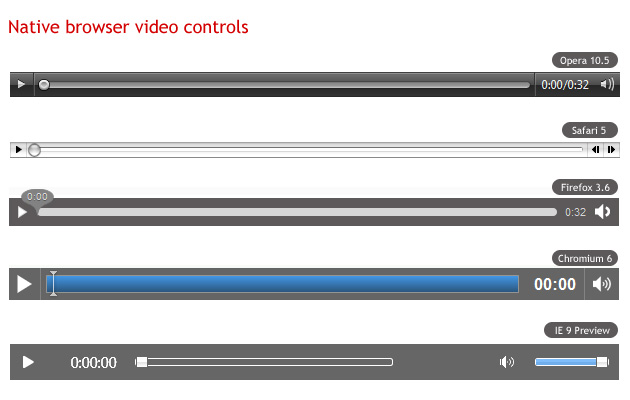
Figure 1: Native browser video controls across different browsers
All media elements in HTML5 support the media elements API, which we can access using JavaScript and use to easily wire up functions such as play, pause, etc. to any buttons we create. Because the native video player plays nicely with other open web technologies, we can create our controls using HTML, CSS, SVG or whatever else we like.
Basic markup for controls
First, we'll need to create the actual markup for the video controls. We'll need a Play/Pause button, a seek bar, a timer and a volume button and slider. We'll insert the markup for the controls after the element, and wrap them up in another element.
We've used classes instead of IDs for all elements, to be able to use the same code for multiple video players on the same page.
Packaging the player as a jQuery plugin
After creating the markup we'll have to tie our elements to the media elements API, in order to control the video's behavior. As noted before, we'll package the player as a jQuery plugin, which will also aid reuse on multiple elements.
AUTHOR'S NOTE: I'm going to assume you are familiar with the basic anatomy of a jQuery plugin, and JavaScript, so I'm only briefly going to explain the script. If you need more information on these subjects, consult Craig Buckler's How to develop a jQuery plugin tutorial, and the JavaScript section of the Opera web standards curriculum.
$.fn.gVideo = function(options) {
// build main options before element iteration
var defaults = {
theme: 'simpledark',
childtheme: ''
};
var options = $.extend(defaults, options);
// iterate and reformat each matched element
return this.each(function() {
var $gVideo = $(this);
//create html structure
//main wrapper
var $video_wrap = $('').addClass('ghinda-video-player').addClass(options.theme).addClass(options.childtheme);
//controls wraper
var $video_controls = $('');
$gVideo.wrap($video_wrap);
$gVideo.after($video_controls);Here we are using jQuery to create the video player markup dynamically (but not the video player itself), and removing the controls attribute once the script loads. That's because in cases where the user has JavaScript disabled, these controls will be useless, and he/she won't even get the native browser controls to the video element. It makes a lot more sense to start with the controls attribute present in case the script fails to load, and then removing it so the player will use our custom controls only after the script successfully loads.
Next, we'll have to target each of the elements in the controls, in order to be able to add listeners.
//get newly created elements
var $video_container = $gVideo.parent('.ghinda-video-player');
var $video_controls = $('.ghinda-video-controls', $video_container);
var $ghinda_play_btn = $('.ghinda-video-play', $video_container);
var $ghinda_video_seek = $('.ghinda-video-seek', $video_container);
var $ghinda_video_timer = $('.ghinda-video-timer', $video_container);
var $ghinda_volume = $('.ghinda-volume-slider', $video_container);
var $ghinda_volume_btn = $('.ghinda-volume-button', $video_container);

$video_controls.hide(); // keep the controls hidden
We're targeting each control by its class; we'll keep the controls hidden until everything is ready.
Now for the Play/Pause controls:
var gPlay = function() {
 if($gVideo.attr('paused') == false) {
  $gVideo[0].pause();
 } else {
  $gVideo[0].play();
 }
};

$ghinda_play_btn.click(gPlay);
$gVideo.click(gPlay);

$gVideo.bind('play', function() {
 $ghinda_play_btn.addClass('ghinda-paused-button');
});

$gVideo.bind('pause', function() {
 $ghinda_play_btn.removeClass('ghinda-paused-button');
});

$gVideo.bind('ended', function() {
 $ghinda_play_btn.removeClass('ghinda-paused-button');
});
Most browsers provide a secondary set of controls for the video in the right-click (ctrl-click on a Mac) context menu. Because of the way we are putting this together, if a user activated these alternative controls it would break our custom controls. In order to avoid this we're attaching events to the Play/Pause button itself, and the "Play", "Pause" and "Ended" listeners of the video player.
We're also adding and removing classes from our button to change the look of it, depending on the state of the video (Playing or Paused).
For creating the seek slider we'll use the jQuery UI Slider component.
var createSeek = function() {
 if($gVideo.attr('readyState')) {
  var video_duration = $gVideo.attr('duration');
  $ghinda_video_seek.slider({
   value: 0,
   step: 0.01,
   orientation: "horizontal",
   range: "min",
   max: video_duration,
   animate: true,
   slide: function(){
    seeksliding = true;
   },
   stop:function(e,ui){
    seeksliding = false;
    $gVideo.attr("currentTime",ui.value);
   }
  });
  $video_controls.show();
 } else {
  setTimeout(createSeek, 150);
 }
};

createSeek();
As you can see, we're using a recursive function, while reading the readyState of the video. We have to keep polling the video until it is ready, otherwise we can't determine the duration, and can't create the slider. Once the video is ready, we initialize the slider, and also show the controls.
Next we'll create the timer, and attach it to the timeupdate listener of the video element.
var gTimeFormat=function(seconds){
 var m=Math.floor(seconds/60)<10?"0"+Math.floor(seconds/60):Math.floor(seconds/60);
 var s=Math.floor(seconds-(m*60))<10?"0"+Math.floor(seconds-(m*60)):Math.floor(seconds-(m*60));
 return m+":"+s;
};

var seekUpdate = function() {
 var currenttime = $gVideo.attr('currentTime');
 if(!seeksliding) $ghinda_video_seek.slider('value', currenttime);
 $ghinda_video_timer.text(gTimeFormat(currenttime));
};

$gVideo.bind('timeupdate', seekUpdate);
Here we're using the seekUpdate function to get the currentTime attribute of the video, and the gTimeFormat function to format the actual value received.
For the volume controls, we'll also use the jQuery UI slider and a custom function on the volume button for muting and un-muting the video.
$ghinda_volume.slider({
 value: 1,
 orientation: "vertical",
 range: "min",
 max: 1,
 step: 0.05,
 animate: true,
 slide:function(e,ui){
  $gVideo.attr('muted',false);
  video_volume = ui.value;
  $gVideo.attr('volume',ui.value);
 }
});

var muteVolume = function() {
 if($gVideo.attr('muted')==true) {
  $gVideo.attr('muted', false);
  $ghinda_volume.slider('value', video_volume);

  $ghinda_volume_btn.removeClass('ghinda-volume-mute');
 } else {
  $gVideo.attr('muted', true);
  $ghinda_volume.slider('value', '0');

  $ghinda_volume_btn.addClass('ghinda-volume-mute');
 };
};

$ghinda_volume_btn.click(muteVolume);
Finally we're going the remove the controls attribute from the , because by this point our own custom controls are set up and we want to use those instead of the browser defaults.
$gVideo.removeAttr('controls');Now that we have our plugin all done, we can call it on any video element we want, like so.
$('video').gVideo();This will call the plugin on all the video elements on the page.
Look and Feel
And now for the fun part, the look and feel of the video player. Once the plugin is ready, customizing the controls is really easy with a little bit of CSS. As you've notice we haven't added any styling to the controls. We'll use CSS3 for all the customizations regarding the player.
First, we'll add some style to the main video player container. We'll use this as the main chrome for the player.
.ghinda-video-player {
 float: left;
 padding: 10px;
 border: 5px solid #61625d;

 -moz-border-radius: 5px; /* FF1+ */
       -ms-border-radius: 5px; /* IE future proofing */
 -webkit-border-radius: 5px; /* Saf3+, Chrome */
 border-radius: 5px; /* Opera 10.5, IE 9 */

 background: #000000;
 background-image: -moz-linear-gradient(top, #313131, #000000); /* FF3.6 */
 background-image: -webkit-gradient(linear,left top,left bottom,color-stop(0, #313131),color-stop(1, #000000)); /* Saf4+, Chrome */

 box-shadow: inset 0 15px 35px #535353;
}
We've floated it left, to prevent it from expanding to the full width of the player, instead keeping it restrained to the width of the actual video element. We're using gradients and border radius to add polish, plus an inset box shadow to emulate the gradient effect in Opera, as it does not yet support gradients (as of 10.60, the latest version at the time of writing).
Next we'll float all the controls to the left, to align them horizontally. We'll use opacity and transitions on the Play/Pause and Volume Mute/Unmute buttons to create a nice hover effect.
.ghinda-video-play {
 display: block;
 width: 22px;
 height: 22px;
 margin-right: 15px;
 background: url(../images/play-icon.png) no-repeat;

 opacity: 0.7;

 -moz-transition: all 0.2s ease-in-out; /* Firefox */
       -ms-transition: all 0.2s ease-in-out; /* IE future proofing */
       -o-transition: all 0.2s ease-in-out;  /* Opera */
 -webkit-transition: all 0.2s ease-in-out; /* Safari and Chrome */
 transition: all 0.2s ease-in-out;
}

.ghinda-paused-button {
 background: url(../images/pause-icon.png) no-repeat;
}

.ghinda-video-play:hover {
 opacity: 1;
}
I'm sure you followed the JavaScript part carefully, and saw that we're adding and removing classes on the Play/Pause button depending on the state of the video(Playing/Paused). That's why the ghida-paused-button class overwrites the background property of the ghinda-video-play class.
Now for the sliders. As you saw before, we're using the jQuery UI slider control for both the seek bar and the volume level. This component has its own styles defined in jQuery UI's stylesheet, but we'll completely overwrite these to make the look of the slider more in keeping with the rest of the player.
.ghinda-video-seek .ui-slider-handle {
 width: 15px;
 height: 15px;
 border: 1px solid #333;
 top: -4px;

 -moz-border-radius:10px;
       -ms-border-radius:10px;
 -webkit-border-radius:10px;
 border-radius:10px;

 background: #e6e6e6;
 background-image: -moz-linear-gradient(top, #e6e6e6, #d5d5d5);
 background-image: -webkit-gradient(linear,left top,left bottom,color-stop(0, #e6e6e6),color-stop(1, #d5d5d5));

 box-shadow: inset 0 -3px 3px #d5d5d5;
}

.ghinda-video-seek .ui-slider-handle.ui-state-hover {
 background: #fff;
}

.ghinda-video-seek .ui-slider-range {
 -moz-border-radius:15px;
       -ms-border-radius:15px;
 -webkit-border-radius:15px;
 border-radius:15px;

 background: #4cbae8;
 background-image: -moz-linear-gradient(top, #4cbae8, #39a2ce);
 background-image: -webkit-gradient(linear,left top,left bottom,color-stop(0, #4cbae8),color-stop(1, #39a2ce));

 box-shadow: inset 0 -3px 3px #39a2ce;
}
Currently the volume slider is also visible at all times, positioned next to the volume button. We'll change this so the slider is hidden by default, and shows up only when we're hovering the Mute/Unmute button, to make it look a bit more dynamic and neater. Again, transitions are our answer here:
.ghinda-volume-box {
 height: 30px;

 -moz-transition: all 0.1s ease-in-out; /* Firefox */
       -ms-transition: all 0.1s ease-in-out; /* IE future proofing */
       -o-transition: all 0.2s ease-in-out;  /* Opera */
 -webkit-transition: all 0.1s ease-in-out; /* Safari and Chrome */
 transition: all 0.1s ease-in-out;
}

.ghinda-volume-box:hover {
 height: 135px;
 padding-top: 5px;
}

.ghinda-volume-slider {
 visibility: hidden;
 opacity: 0;

 -moz-transition: all 0.1s ease-in-out; /* Firefox */
       -ms-transition: all 0.1s ease-in-out;  /* IE future proofing */
       -o-transition: all 0.1s ease-in-out;  /* Opera */
 -webkit-transition: all 0.1s ease-in-out; /* Safari and Chrome */
 transition: all 0.1s ease-in-out;
}

.ghinda-volume-box:hover .ghinda-volume-slider {
 position: relative;
 visibility: visible;
 opacity: 1;
}
We're hiding the volume slider by default, and giving the volume container a small fixed height that just fits the width of the volume button. We're also assigning transitions to both.
When the volume button is hovered, its height increases via the specified transition; we then use the .ghinda-volume-box:hover .ghinda-volume-slider descendant selector to transition the volume slider into view.
With basic CSS knowledge and some new CSS3 properties, we've already created a nice interface for our player, it looks like Figure 2:
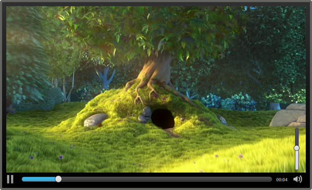
Figure 2: Our finished video player.
Themeing the player
As you probably noticed, when creating the jQuery plugin, we've defined a set of default options. These options are theme and childtheme, and can be changed when calling the plugin, allowing us to easily apply custom themes as desired.
A theme represents a completely new set of CSS rules for every single control. A child theme on the other hand is a set of CSS rules that builds upon the rules of an existing theme, adding or overwriting the "parent" theme's style.
We can specify both of there options or only one, when calling the jQuery plugin.
$('video').gVideo({
 childtheme:'smalldark'
});
In the above example code we are calling the plugin with the smalldark child theme specified. This will apply our default parent theme, and then apply our child theme over the top of it, overwriting a small portion of the rules set by the parent theme. See Figure 3 for the Smalldark theme in action.
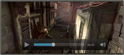
Figure 3: the Smalldark child theme in action.
You can check out the final video player example live to see both themes in action, or download the source code (8.5mb, ZIP file) and experiment with it further.
Summary
Building our own custom video player with HTML5 video, JavaScript and CSS3 is fairly easy. By using JavaScript only for the actual functionality of the controls, and CSS3 for everything that involves the look and feel of the player, we get a powerful, easily customizable solution.
HTML5 Video resources
Thursday, July 22, 2010
HTML 5 and CSS 3: The Techniques You’ll Soon Be Using
Web designers can do some pretty cool stuff with HTML 4 and CSS 2.1. We can structure our documents logically and create information-rich sites without relying on archaic, table-based layouts. We can style our web pages with beauty and detail without resorting to inline and
tags. Indeed, our current design methods have taken us far beyond the hellish era of browser wars, proprietary protocols, and those hideous flashing, scrolling, and blinking web pages.
As far as we’ve come using HTML 4 and CSS 2.1, however, we can do better. We can refine the structure of our documents and increase their semantic precision. We can sharpen the presentation of our stylesheets and advance their stylistic flexibility. As we continue to push the boundaries of existing languages, HTML 5 and CSS 3 are quickly gaining popularity, revealing their collective power with some exciting new design possibilities.
GOODBYE
SOUP, HELLO SEMANTIC MARKUP
While slightly contrived, this example serves to illustrate the structural redundancy of designing complex layouts with HTML 4 (as well as XHTML 1.1 et al). Fortunately, HTML 5 alleviates
-soup syndrome by giving us a new set of structural elements. These new HTML 5 elementsreplace meaningless
s with more semantically accurate definitions, and in doing so provide more “natural” CSS hooks with which to style the document. With HTML 5, our example evolves:
Continue in next post
Sunday, July 18, 2010
Google signs agreement with ITA for $700 Millions
Google has announced, that it has acquired ITA, a Boston based software company for $700 million. ITA specializes in the collection and organization of the airline data, details of the flight timings including the price of the availability of the flights for the specified destinations.
Google feels delighted to say that this software would make it easier for the users to book their air tickets online. In addition, users would get the correct and better flight information, without having to go out any where. This service would definitely encourage the passengers to book their air tickets and would increase the percentage of such passengers.
As of now, the customizable flight data is used by leading airlines and travel distributors worldwide including Alaska Airlines, American Airlines, Bing, Continental Airlines, Hotwire, Kayak, Orbitz, Southwest Airlines, TripAdvisor, United Airlines, US Airways and Virgin Atlantic Airways and it would continue in the future also. Since Google doesn't currently compete against ITA Software, the deal will not change existing market shares.
Friday, July 16, 2010
web 3d india is now online

Web 3d India was founded in 2008. We started this comapany in room in 2009 in New Delhi. Now we have a wide range of technical expertise including web development website design, Psd To HTML, Charactor modeling, add Designing and high quality 3d modling services.
Subscribe to:
Posts (Atom)